

Every growing frontend team hits the same wall: five slightly different buttons, three date pickers, and a modal that behaves differently on every page. A shared component library fixes that. At Squareflo, contributing reusable components to our in-house UI library saved roughly 200 hours of development time a month, simply because teams stopped rebuilding the same things.
But a library only saves time if people want to use it. This guide covers how to build one that's typed, documented, accessible and easy to upgrade.
Step 1: Decide What Belongs in the Library
Not every component should be shared. A good rule:
- Yes: generic building blocks used in more than one place, such as
Button,Input,Select,Modal,Tooltip,Table,Toast. - Maybe: composite patterns that repeat with little variation, like
PageHeader,EmptyStateorConfirmDialog. - No: components that encode one feature's business logic. Those stay in the app.
Tip
Start small. Five excellent, well-documented components beat fifty half-finished ones. Grow the library when the same need shows up in a second place.
Step 2: Set Up the Project
A minimal, modern setup uses TypeScript, tsup for bundling and React as a peer dependency, so apps don't end up with two copies of React:
mkdir ui && cd ui
npm init -y
npm install -D typescript tsup react react-dom @types/react @types/react-dom
{
  "name": "@acme/ui",
  "version": "0.1.0",
  "type": "module",
  "main": "./dist/index.cjs",
  "module": "./dist/index.js",
  "types": "./dist/index.d.ts",
  "exports": {
    ".": {
      "types": "./dist/index.d.ts",
      "import": "./dist/index.js",
      "require": "./dist/index.cjs"
    },
    "./styles.css": "./dist/index.css"
  },
  "files": ["dist"],
  "sideEffects": ["**/*.css"],
  "peerDependencies": {
    "react": ">=18",
    "react-dom": ">=18"
  },
  "scripts": {
    "build": "tsup src/index.ts --format esm,cjs --dts --clean"
  }
}
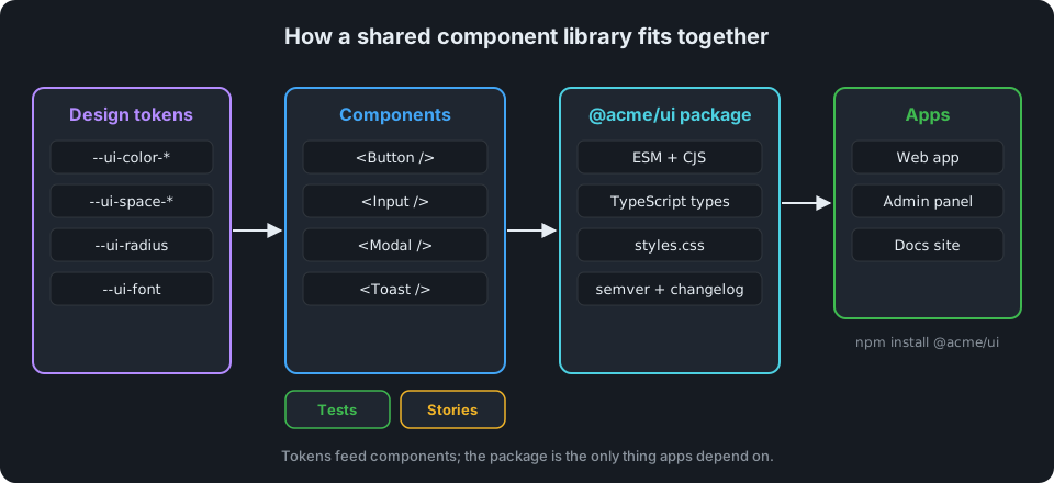
Organize the source so each component is self-contained:
src/
  components/
    Button/
      Button.tsx
      Button.css
      Button.test.tsx
      index.ts
  tokens.css
  index.ts        <- the public API: only what's exported here is supported
Step 3: Define Design Tokens First
Hard-coded colors and spacing are what make components drift apart. Put them in one place as CSS custom properties:
/* tokens.css */
:root {
  --ui-color-primary: #1e88e5;
  --ui-color-primary-hover: #1565c0;
  --ui-color-danger: #e53935;
  --ui-color-text: #1f2328;
  --ui-radius: 8px;
  --ui-space-2: 8px;
  --ui-space-3: 12px;
  --ui-space-4: 16px;
  --ui-font: system-ui, -apple-system, "Segoe UI", sans-serif;
}
Components only reference tokens, never raw values. Theming (dark mode, a second brand) then means overriding variables, not rewriting components.
Step 4: Build a Component the Right Way
Here's a Button that shows the patterns every component should follow:
// src/components/Button/Button.tsx
import { forwardRef, type ButtonHTMLAttributes } from "react";
import "./Button.css";

type Variant = "primary" | "secondary" | "danger";
type Size = "sm" | "md" | "lg";

export interface ButtonProps extends ButtonHTMLAttributes<HTMLButtonElement> {
  variant?: Variant;
  size?: Size;
  loading?: boolean;
}

export const Button = forwardRef<HTMLButtonElement, ButtonProps>(function Button(
  { variant = "primary", size = "md", loading = false, disabled, className, children, ...rest },
  ref,
) {
  const classes = ["ui-button", `ui-button--${variant}`, `ui-button--${size}`, className].filter(Boolean).join(" ");

  return (
    <button
      ref={ref}
      type="button"
      className={classes}
      disabled={disabled || loading}
      aria-busy={loading || undefined}
      {...rest}
    >
      {loading && <span className="ui-button__spinner" aria-hidden="true" />}
      {children}
    </button>
  );
});
What's worth copying here:
- It extends native props.
onClick,aria-*,form,name: everything a normal<button>supports just works, through...rest. - It forwards refs, so apps can focus it or attach tooltips and popovers. (In React 19,
refcan also be passed as a regular prop, butforwardRefkeeps you compatible with React 18 apps.) - It has safe defaults.
type="button"prevents accidental form submits, andvariantandsizehave sensible defaults. classNameis merged, not replaced, so apps can add layout tweaks without losing your styles.- The loading state is accessible: the button is disabled and announces
aria-busy.
/* src/components/Button/Button.css */
.ui-button {
  display: inline-flex;
  align-items: center;
  gap: var(--ui-space-2);
  border: 0;
  border-radius: var(--ui-radius);
  font-family: var(--ui-font);
  font-weight: 600;
  cursor: pointer;
  color: #fff;
  background: var(--ui-color-primary);
}
.ui-button:hover:not(:disabled) { background: var(--ui-color-primary-hover); }
.ui-button:disabled { opacity: 0.6; cursor: not-allowed; }
.ui-button:focus-visible { outline: 3px solid var(--ui-color-primary); outline-offset: 2px; }

.ui-button--sm { padding: 6px 10px; font-size: 13px; }
.ui-button--md { padding: var(--ui-space-2) var(--ui-space-4); font-size: 15px; }
.ui-button--lg { padding: var(--ui-space-3) 20px; font-size: 17px; }

.ui-button--secondary { background: transparent; color: var(--ui-color-primary); box-shadow: inset 0 0 0 1px currentColor; }
.ui-button--danger { background: var(--ui-color-danger); }
Warning
Never remove the focus outline without replacing it. Keyboard users rely on it, and :focus-visible shows it only when it's needed.
Step 5: Export a Deliberate Public API
// src/index.ts
import "./tokens.css";

export { Button } from "./components/Button";
export type { ButtonProps } from "./components/Button";
Anything not exported from index.ts is private and free to change. That boundary is what lets you refactor internals without breaking apps.
When tsup builds the library, the CSS imported by your components is collected into dist/index.css (exposed as @acme/ui/styles.css in package.json). Apps import it once at their entry point, then use components anywhere:
// In the app, e.g. main.tsx or app/layout.tsx
import "@acme/ui/styles.css";
import { Button } from "@acme/ui";

export function SaveBar() {
  return <Button onClick={() => console.log("saved")}>Save changes</Button>;
}
Step 6: Document Every Component
If developers can't quickly see what a component does, they'll build their own. Storybook is the standard tool; each component gets "stories" showing its states:
// src/components/Button/Button.stories.tsx
import type { Meta, StoryObj } from "@storybook/react";
import { Button } from "./Button";

const meta: Meta<typeof Button> = { title: "Components/Button", component: Button };
export default meta;

type Story = StoryObj<typeof Button>;

export const Primary: Story = { args: { children: "Save changes" } };
export const Secondary: Story = { args: { children: "Cancel", variant: "secondary" } };
export const Danger: Story = { args: { children: "Delete", variant: "danger" } };
export const Loading: Story = { args: { children: "Saving…", loading: true } };
Deploy Storybook somewhere the whole team can reach it, and link it from your README.
Step 7: Test Behavior, Not Markup
Tests should check what users experience, not class names. With Testing Library:
// src/components/Button/Button.test.tsx
import { render, screen } from "@testing-library/react";
import userEvent from "@testing-library/user-event";
import { Button } from "./Button";

test("calls onClick when clicked", async () => {
  const onClick = vi.fn();
  render(<Button onClick={onClick}>Save</Button>);
  await userEvent.click(screen.getByRole("button", { name: "Save" }));
  expect(onClick).toHaveBeenCalledOnce();
});

test("is disabled while loading", () => {
  render(<Button loading>Save</Button>);
  expect(screen.getByRole("button", { name: "Save" })).toBeDisabled();
});
(These examples use Vitest's vi.fn(); with Jest, use jest.fn() and toHaveBeenCalledTimes(1).)
Step 8: Version and Release Carefully
Apps depend on your library the same way clients depend on an API, so follow semantic versioning:
- Patch (
1.4.2→1.4.3): bug fixes only. - Minor (
1.4.3→1.5.0): new components or new optional props. - Major (
1.5.0→2.0.0): anything that can break an app, such as removed props or changed defaults.
Keep a changelog, and for breaking changes write a short migration note. Tools like Changesets automate the version bumps and changelog for you.
Step 9: Make Adoption Easy
The best library still fails if nobody uses it. A few habits help:
- Pair with feature teams. Replace a few hand-built components with library ones together; it's the fastest way to find gaps.
- Accept contributions. A clear "how to add a component" guide turns users into contributors.
- Mentor through code review. Point people to the library component instead of approving another one-off.
- Measure it. Track how many screens use library components; it's a convincing number to show leadership.
Summary
A reusable component library pays off when it's typed, accessible, documented, tested and versioned like a product. Start with a handful of core components, build them carefully, and grow the library as real needs appear. Your future self, and every developer on your team, will spend less time rebuilding buttons and more time shipping features.